top of page
Brand & Website Design
Pineapple Exprs
September 2018

About
Pineapple Express is mobile bartending service caters to workplaces, receptions, outdoor weddings, business parties, etc. They produce intimate events for fifty guests or less, all the way up to corporate events serving thousands of guests. The most interesting thing that they provide everything but alcohol. I designed their brand and website to help them increase conversions and improve the user experience. Also i have created photographs and video advertisement for this business.
Designing the brand
The problem was to design and create brand with a website for mobile bartending service with easy to use for both customers and stakeholder sides.
Company Name is Pineapple Express, and it interacts with famous movie. We decide to rethink the name of the website, and we come up with new names “Pineapple Exprs” and “Pineapple Xpress”. After long considerations, we stopped at “Pineapple Exprs”.
The Logo
After talking to the client and doing some research into the company, it was clear that the brand needed to have “hawaiian”, tropical style with a summer feel all year round. We wanted to create a symbol that represented the company and its ideals of life, energy, happiness and positivity.
I sketched out a bunch of ideas (above left) for the logo symbol, concentrating on the combination of the shape and text, also creating a logo we always need to think that the difference between width and height shouldn’t be huge. I wanted to take a more realistic approach and focus on the leaves of the fruit. I started using curves to draw leafs in various shapes and sizes to create their realistic look.

We threw some ideas around and started looking to the tropical theme, particularly fruits, for inspiration. We discovered that the pineapple will be a great fit, because of its name and association. What we feel looking at the pineapple? Something tropical and wild on one side and sweet, fresh and sunny on other. Focusing on the colors of this fruit we can see yellow, wich filled with positive and happiness, and green - the color of freshness, energy and life. Adding a splash of pink for a company name will make it sweet and charming. The color pink is the color of universal love of oneself and of others, and it can make you happier.
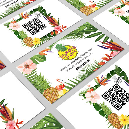
The complementary color palette (above) was inspired by the pineapple fruit colors. We went for clean and tropical, using pink Billabong font for a company name and HelvLight Regular for contact information. The business card design (above right) was perfectly showing tropical feel with a help of tropical leafs, pineapple and flamingo. They were, printed on classic thick matte stock, which went well with the brand.
Imagery
Imagery needed to portray the real bar set-up. Before we made an appointment for a shoot of a bar, we’ve created a mood board above.


Research and discovery

Along with the new branding, I also needed to create and build a new website to replace the old one, which wasn’t responsive. The first thing I did was try and figure out what was working, and what wasn’t, on the old website. Luckily the old website was hooked up to Google Analytics, so I had some idea of how it was being used. Some quick customer interviews also provided useful insights including; some users found the website difficult to read on mobiles, some thought the website looked dated and cluttered and many couldn’t find the content they were looking for.

The first two customer pain points above were relatively simple problems to solve, but the third one required some extra thinking. When designing a website, one of the first things that needs to be figured out is the content. Content is definitely king. Why did they come to your website? How can you solve their problem? Once the purpose of the website is clear, you can find the most effective way to deliver the message. Content was written based on insights from customer interviews, research and a competitor analysis.
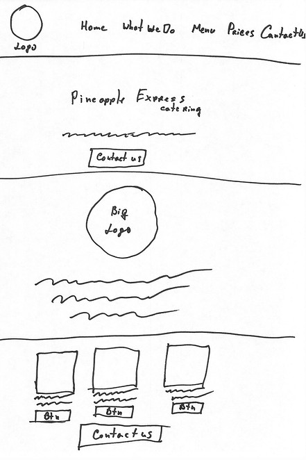
It was clear that we basically needed a simple brochure website that outlined the company’s services and gave potential customers an easy way to get in touch. We decided to go with a multi-page website as seen in the sitemap above. Clicking on a link in the top navigation bar would go to another page. I sketched out wireframes (above) for each page of the site to block out the basic elements and to give me some blueprints to work from.
Designing the visuals
Now that we had a brand, a website blueprint and content to work with, it was time to push some pixels around. We wanted the design aesthetic to be minimal with a strong focus on content and typography. A lot of the hard work had already been done creating the wireframes. Now it was simply a matter of experimenting with colours and layout and also creating the image assets.
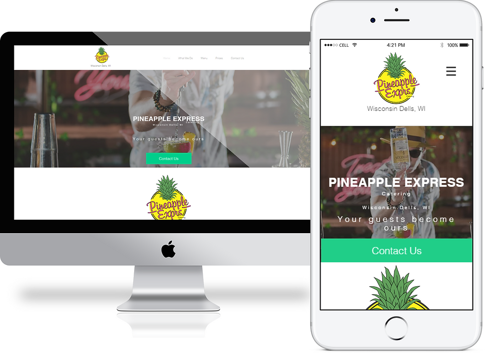
On the above homepage, the image of the bartender pouring drink into a cocktail glass moves independently from the background to create a subtle parallax effect. The navigation bar is stuck to the top of the browser and follows the user as they scroll, to ensure that they can easily navigate to different page of the website.
User testing validated that customers were able to find the information they were looking for, both on desktop and mobile. We received positive feedback about the new branding and the conversion rate also increased which was awesome to see. It was refreshing to work with a client who was so passionate about his business. We were able to work together to create a website and brand that not only fulfilled its purpose, but was one that we could both be proud of too.
Testing
bottom of page